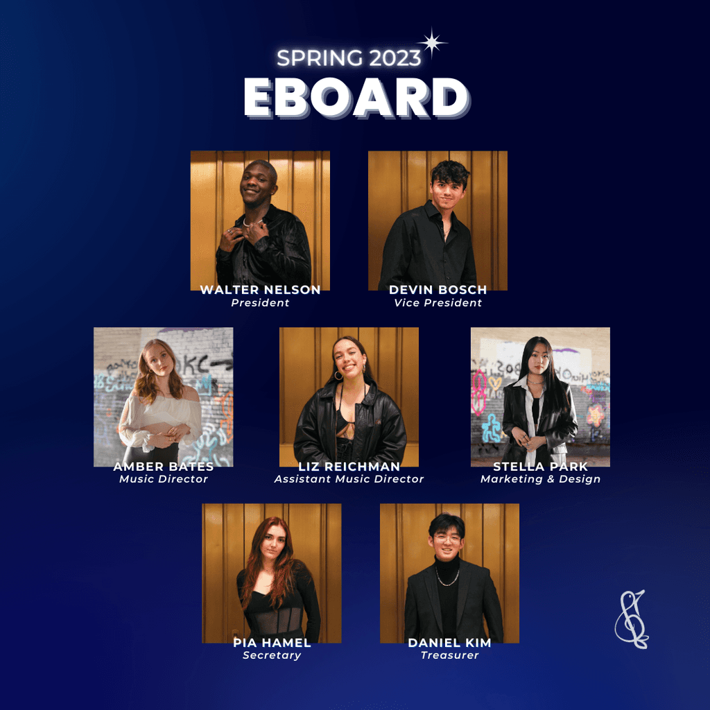
Marketing and Design Director
Treblemakers
Executive Board
Figma
Adobe Illustrator
Canva
Meta Ads
Professional Dashboard
Branding
Graphic Design
Social Media
ROLE
TEAM
TOOLS
SKILLS

Elevating A Cappella Group's Social Media Presence
Improving the brand identity, quality of design, and engagement on social media
BU TREBLEMAKERS
Despite the group’s big presence on campus, they lacked much presence on social media; they were only 3rd (out of 13 a cappella groups) in terms of followers count and didn’t have much engagement on Instagram.
The Problem
These were some of the biggest causes that led to this problem.
Lack of branding and consistency
Lack of quality in the designs
Lack of digital marketing strategies
SOLUTION
Before diving in, I established these three solutions as my goals for my time as the Marketing and Design Director.
Establish a strong brand identity that effectively reflects the group’s image and “vibe”
Keep everything consistent (e.g. graphics, tone, etc.)
Develop a digital marketing strategy and lead to a quantifiable impact (e.g. increase in engagement, followers count, etc.)
After presenting my idea and making multiple iterations, I decided to change these things from the existing brand and add new elements:
The New Brand
And here are the ones I decided to keep:
Welcoming image
The Treblemakers slogan is “Fun. Love. Music.” The group is known for its positive, hype energy and family-like environment, and I wanted to reflect on the design, especially for the Fall audition season in order to accurately reflect the group’s vibe and attract new auditionees.
Birthday posts
We initially thought about getting rid of posting about the members’ birthdays on the feed for the sole reason that it clogs the feed. We tested out posting it on the Story instead but came to the conclusion that making it as a post allows for more interaction and engagement.
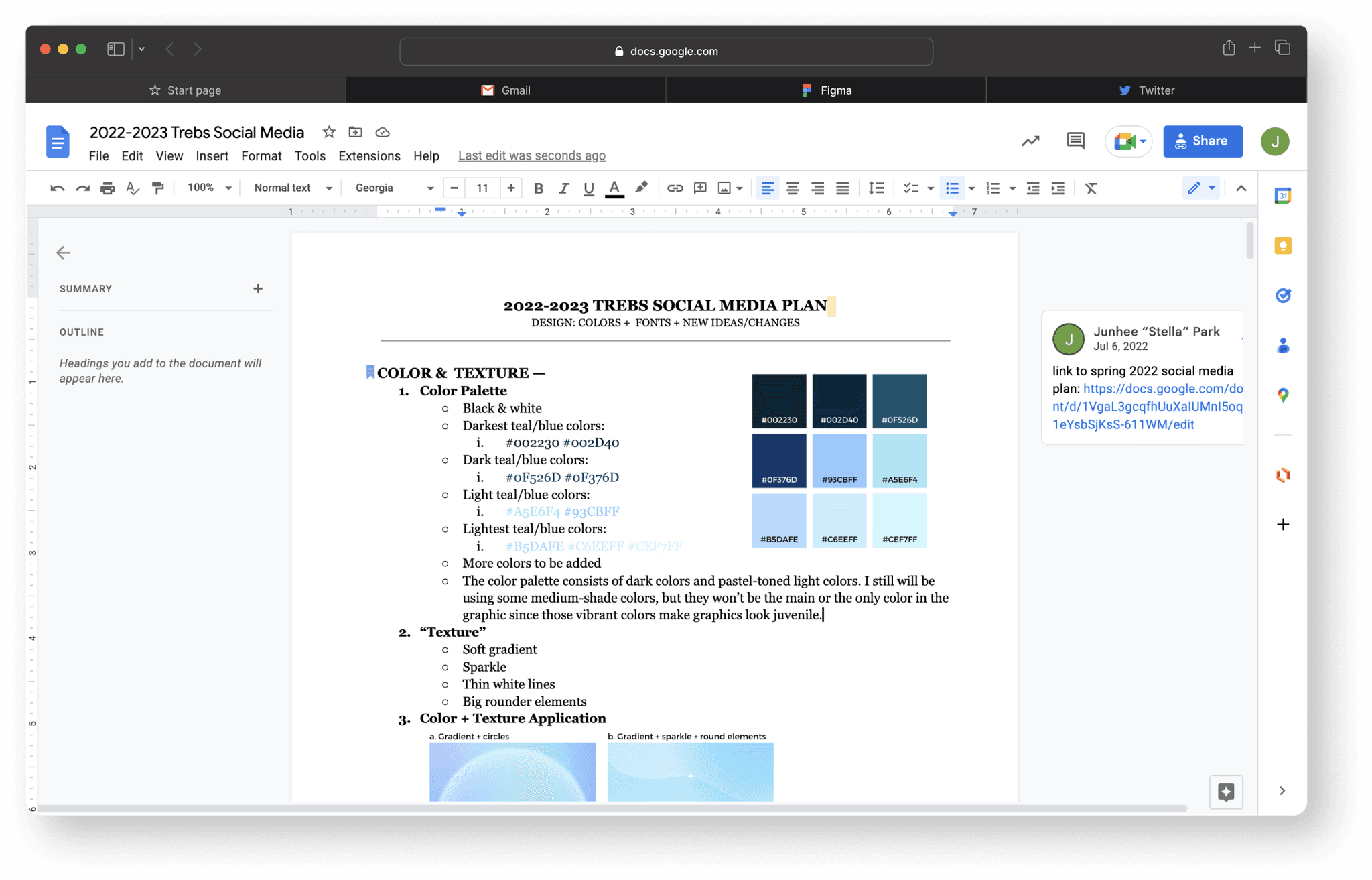
Brand color → from teal to blue
Teal is more frequently used in retro designs and generally gives off impressions of old, outdated designs.
Typography → from Serif to San Serif
Rounded and bold San Serif typefaces reflect the group better and generally look more modern than Serif, which is what we needed.
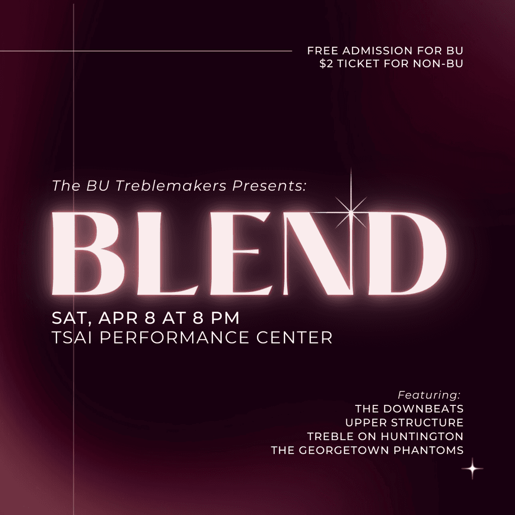
Instead of fully getting rid of the use of Serif fonts, I decided to keep them for big concerts such as NOBUAC (Night of BU A Cappella), Blend (Spring Concert with guest groups), and Final Concerts. ..
Visual assets → added shiny & glowy elements and effects
There weren't any pre-existing assets, so I decided to include glowy and shiny elements as one of the elements, utilizing the shiny star as the main asset.
The New Brand Guide


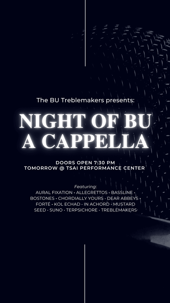
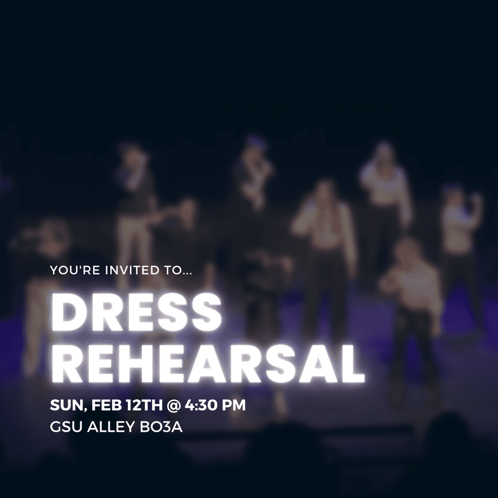
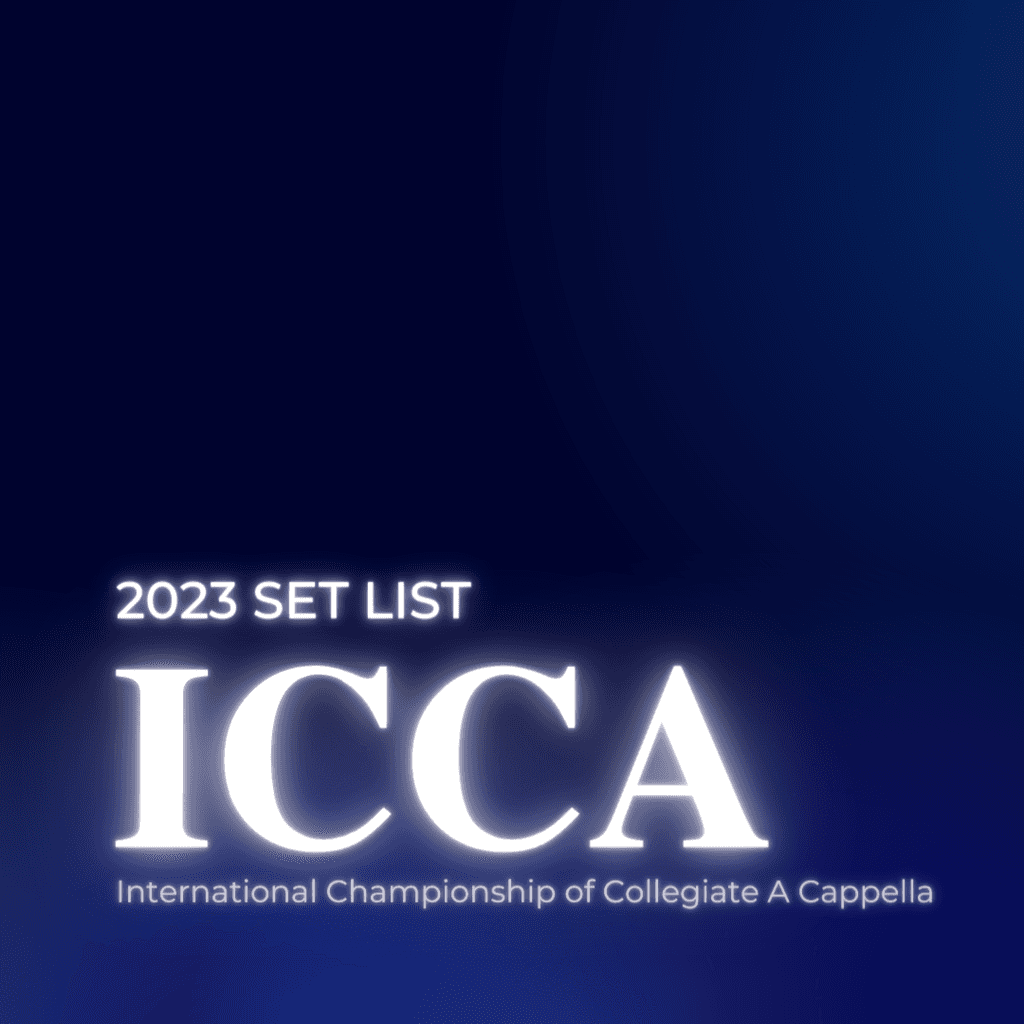
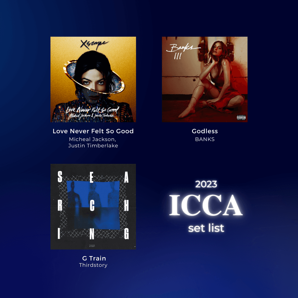
Below are the graphics from Spring 2023 Semester: To contrast with the light blue theme, I switched the color to be darker, portraying more seriousness and a mature vibe, which is more fitting for the competition season.
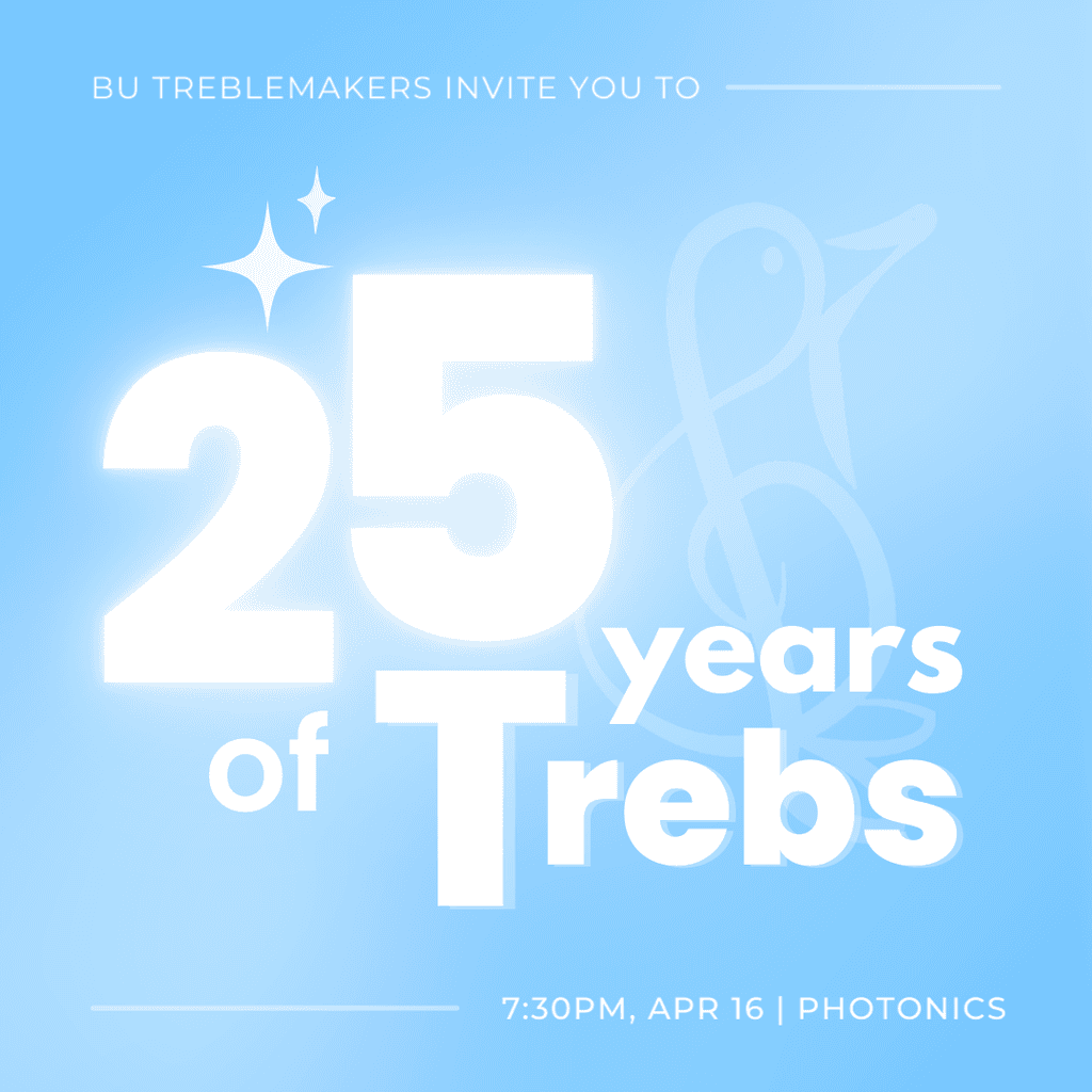

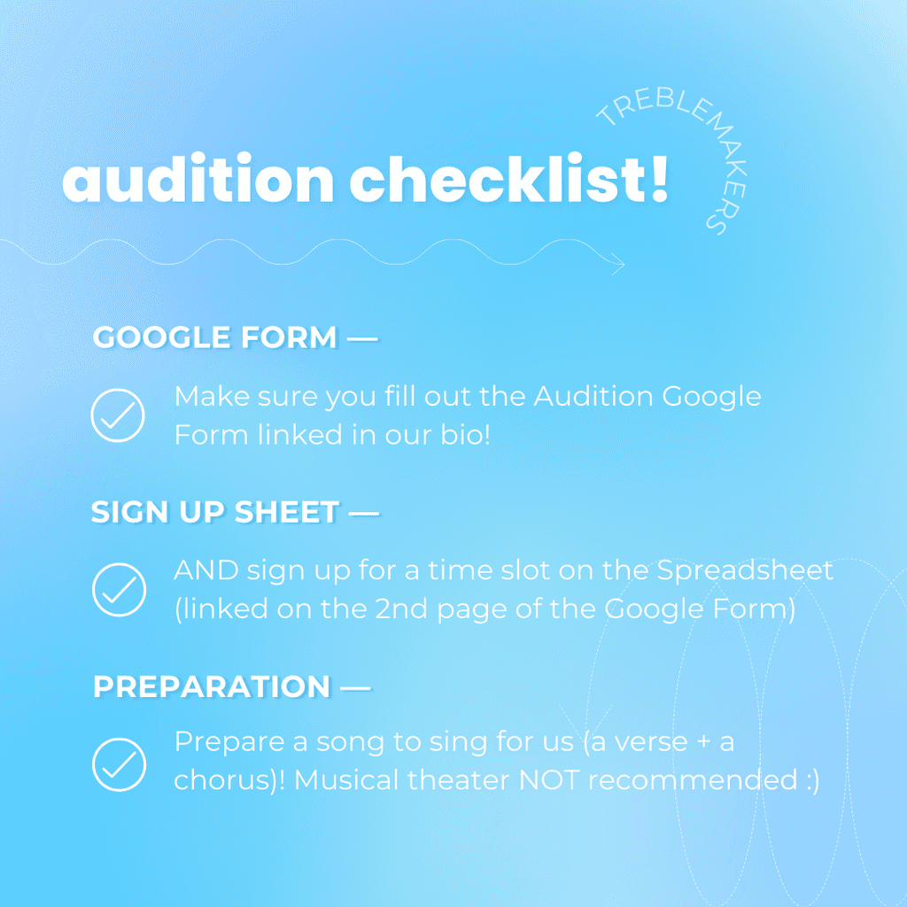

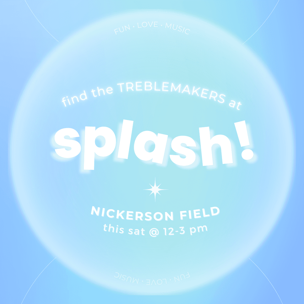

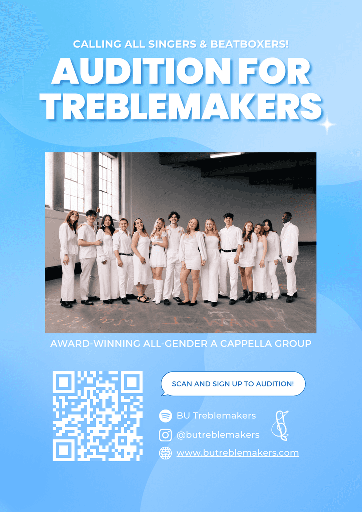
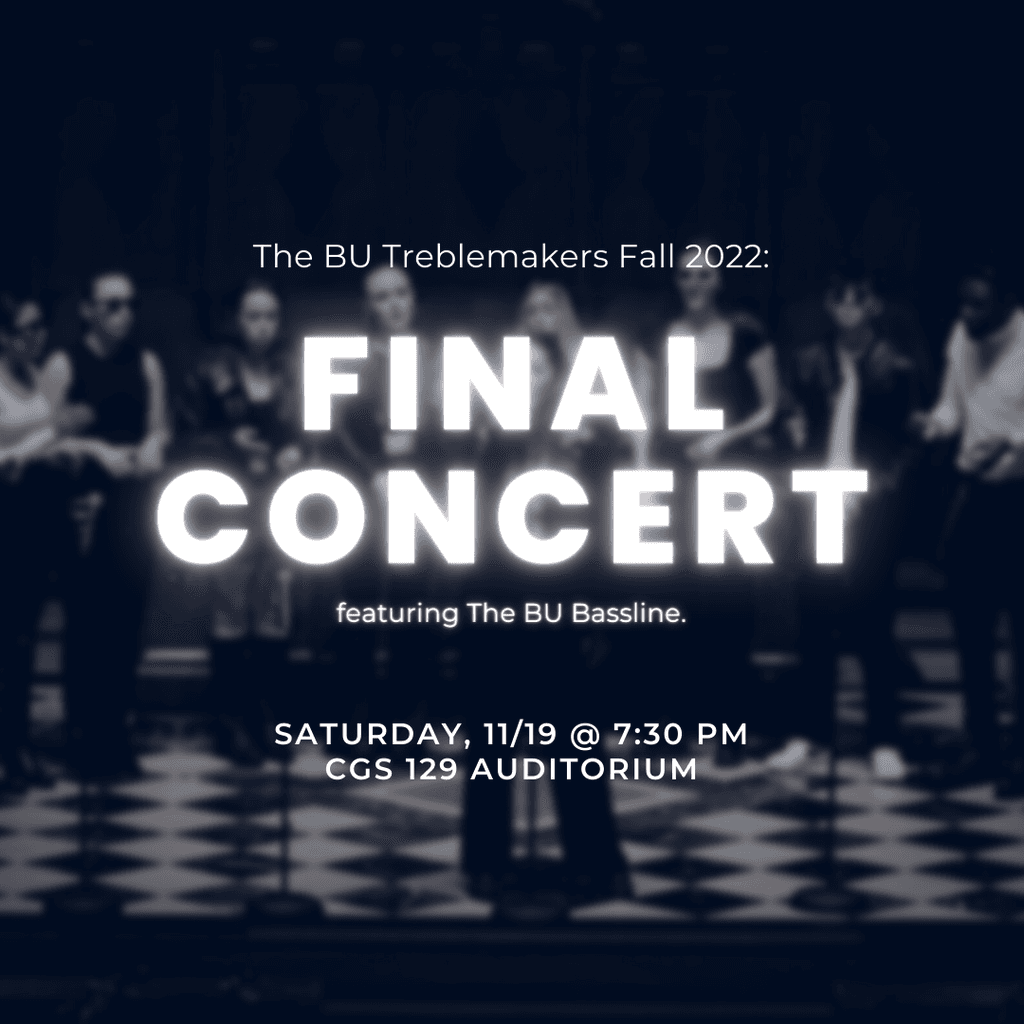
Below are the graphics for Fall 2022 Semester: I utilized light blue to fit the vibrant and fun energy that the group has to promote the group to potential auditionees. The blue gradient and shiny elements highlight the group's slogan, "Fun. Love. Music."
Final Graphics
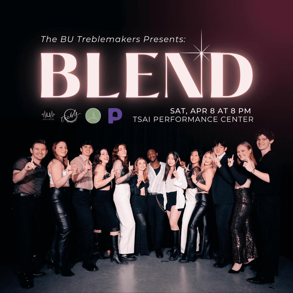
After months of following the newly established brand guidelines, I decided to change it up for the upcoming concert with a pink photoshoot and feed, while keeping everything else (type, assets, etc.) the same. As pink/red are complementary colors of green/blue, it contrasted with the rest of the graphics and received a lot of positive feedback as a result! Below are the two main graphics used for promotion!
Special Initiatives:
Spice It Up!
The following summer, the group released a new EP called “CADENCE.” This time, I changed up from the branding guideline to really contrast with the rest of the feed. San Serif to Serif, blue to white, and gradient and shiny elements to grain and paper texture. I also created visual teaser for each track in the EP.


Overall, I increased the engagement and follower count by over 50%, making the Treblemakers Instagram account from the third to the first with the most followers. This enhancement also elevated the audience’s concert experience through various visuals during the event, such as graphics for performance backdrops, concert orders, and more.
The Impact
This was my first branding project and graphic design work that I did since starting college. Before starting this project, I had no idea what branding was or how to brand a product or a group. Self-teaching myself how to design and how to brand was so much fun, and I was able to discover my love and joy in branding! My position as the Marketing and Design Director filed my interest in design and led me to the world of UX Design!
Reflection