Graphic Design Intern
BU Spark! Communications Team
Figma
Adobe Illustrator
FigJam
Trello
Graphic Design
Branding
Collaborations
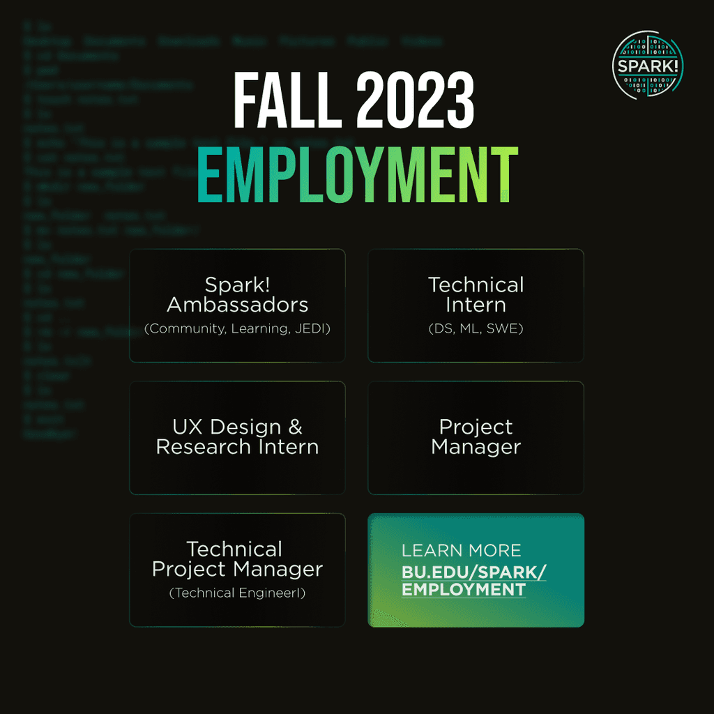
ROLE
TEAM
TOOLS
SKILLS
Elevating A Cappella Group's Social Media Presence
Improving the brand identity, quality of design, and engagement on social media
BU SPARK!
BU Spark! is an innovation and experiential learning lab for computing, data science, engineering, and UX design projects housed at the Boston University Faculty for Computing & Data Sciences. Spark! supports student innovation and engagement in applied research and real-world projects while fostering an inclusive and interdisciplinary community.
Project Overview
BU Spark! is an innovation and experiential learning lab for computing, data science, engineering, and UX design projects housed at the Boston University Faculty for Computing & Data Sciences. Spark! supports student innovation and engagement in applied research and real-world projects while fostering an inclusive and interdisciplinary community.
I worked closely with the Director of BU Spark! who is passionate and particular about branding. I went through iterations and failures (more details below), and ultimately led to final designs that were approved by the Director!
Spark! uses keywords like “innovation” and “entrepreneurship” a lot. These are linked closely with coming up with new ideas like a spark! Contrary to its mission, however, the colors and the brand image didn’t exactly represent the “new” or “techy” aspects. I was given the task to elevate and refine the brand, rather than completely disregarding the current brand image.
The Problem
The designs on social media also lacked consistency. Some designs were completely out of the brand guidelines or looked unorganized and unprofessional, which was one of the biggest problems that the Director pointed out. Below is the Instagram feed before; the graphics had similar color scheme, but different style in all of them.
Solution: Initial Ideation
Get rid of one of the accent colors (orange) and add blue
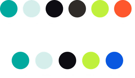
I made this decision because the design looks more modern and gives the techy vibe that the current color palette lacks. This shade of blue also complemented the teal better than the orange, allowing us to stick with the primary brand image (the retro feel) while elevating it to look more modern by adding blue. I envisioned these two colors to represent the students involved with BU Spark! (teal = new students who are starting out; blue = older students who have more experience and knowledge from the programs offered at Spark!)
Why?
→ Teal (retro) + blue (high tech)
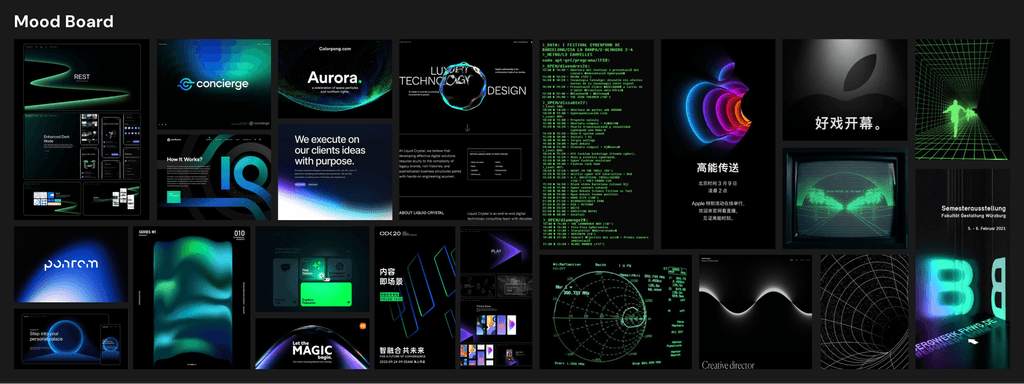
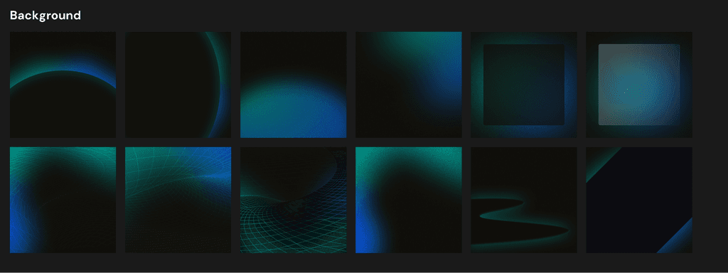
Below is the mood board alongside some sample designs I've created, which could be utilized as graphic backgrounds.
Besides the color, I also made a few changes to the existing typefaces and assets that didn't give flexibility in designing. Below are the four typefaces that I replaced.

Uh-oh…
After spending hours on creating the moodboard, sample backgrounds, and assets and selecting new colors and typefaces, I had my pitch ready to present to the Director… until I realized that I misunderstood the assignment.
When I presented my vision to the Director, it turned out to be something that was not in alignment with what she wanted to keep and change.
Failure:
Lessons Learned
The main cause of the failure was the miscommunication. What I was told to change was not aligned with what the Director wanted. I made changes to the design that she liked, such as some social media templates and the color palette.
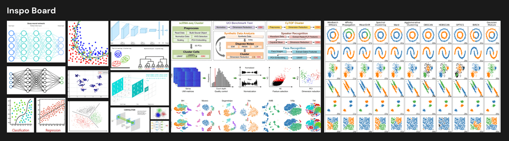
The main criticism I received was that this new design, especially with the use of the vibrant blue, is too corporate-techy. Since Spark! offers program for students studying computer science, data science, artificial intelligence, and machine learning, we needed to include assets that symbolize those topics. So I scrapped everything that I’ve been working on and started a new board with more sample designs to communicate the newly revised vision.
Taking the feedback from the Director, I created sample graphics that were much more in alignment with the Director's taste. Some took more iterations than others, but it helped me a lot in understanding the vision and branding.
Revision,
Revision,
Revision


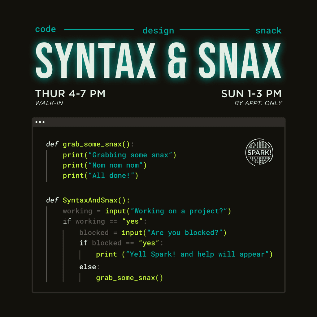
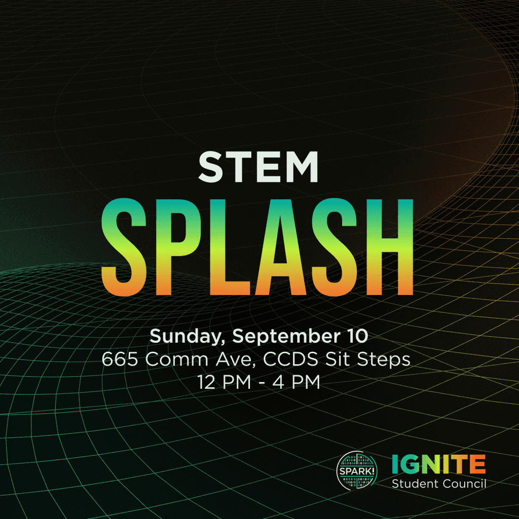
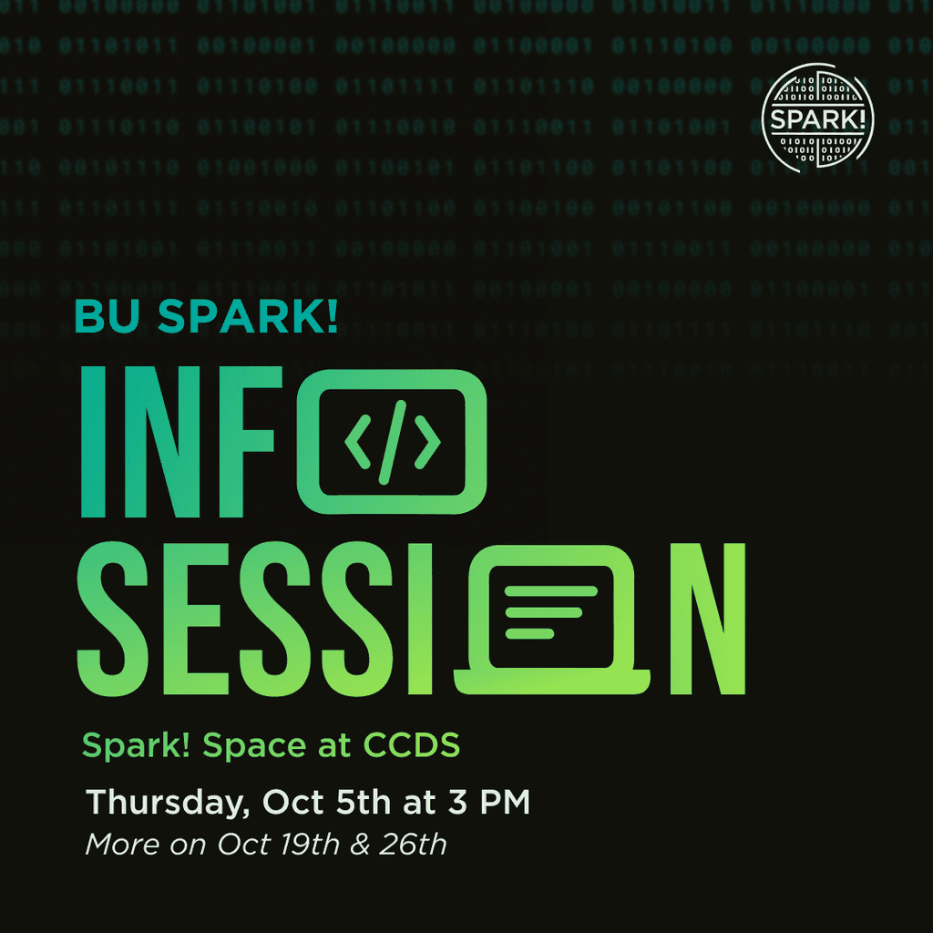
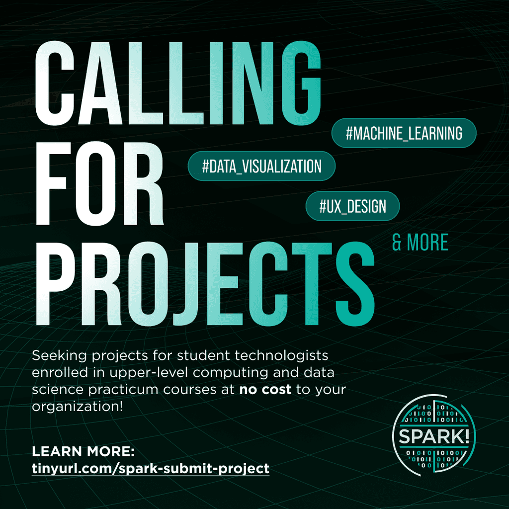
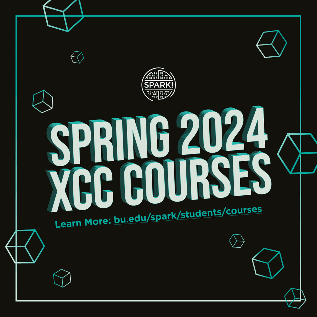
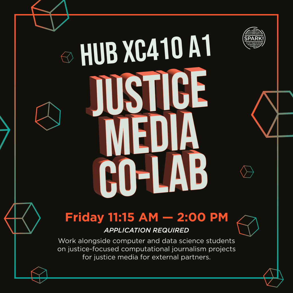
Below is the approved changes / finalized elements.
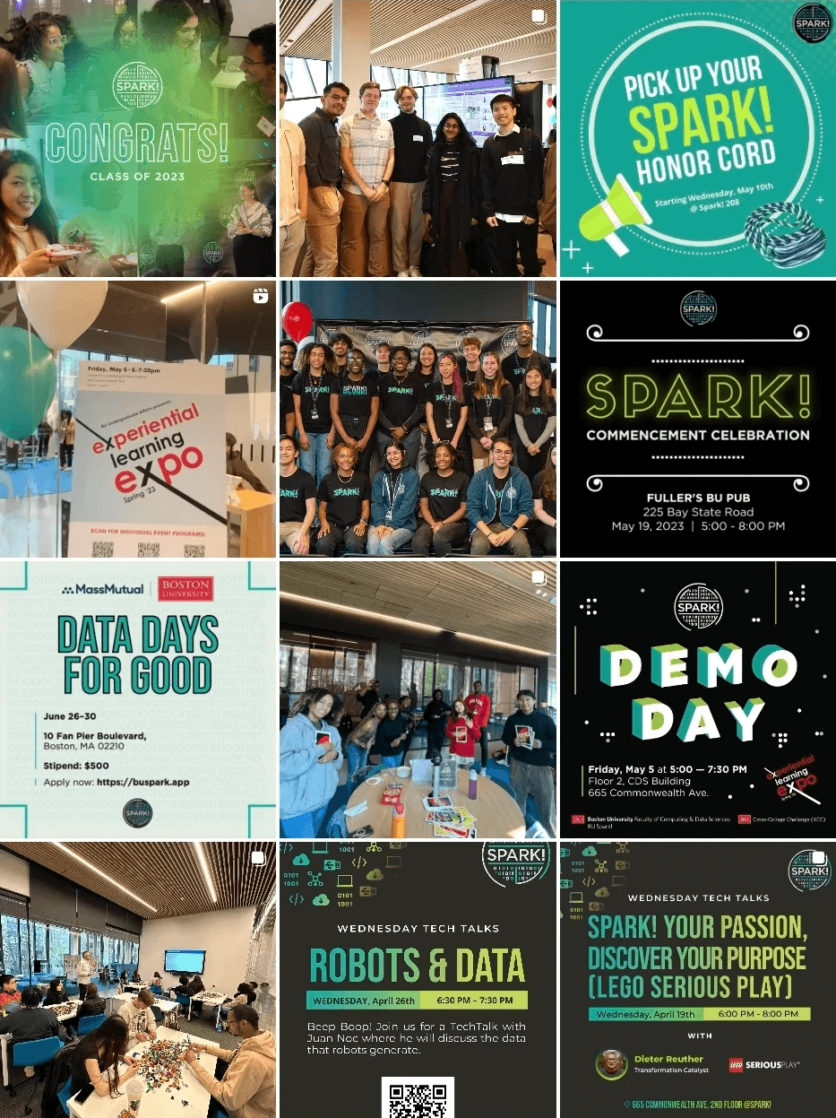
After the revised branding board was made, I revised existing graphics and created new ones. Every one of them was approved by my manager and the Director, and I made a lot of iterations to accurately reflect their vision! These graphics were also created in sizes of Eventbrite header, flyer, A-Frame board, and big digital signage.
The Final Product

From this experience, I learned that overcommunication is key; don’t make an assumption when unsure, and don’t be afraid to ask clarifying questions. I also gained insight into separating my style from the client’s style. Though the initial concept was what I liked better, that was not what the Director wanted. These lessons have enhanced my approach to future collaboration and underscored the significance of clear communication and adaptability in achieving shared goals.
Reflection